Introduction
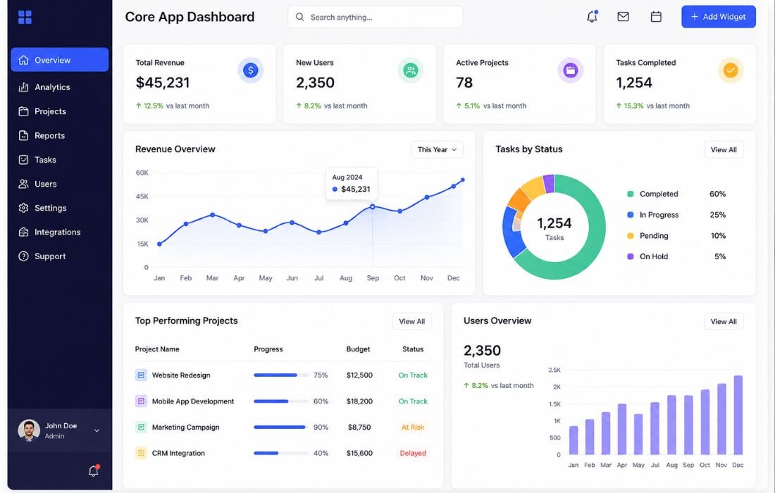
Businesses today rely on data driven decisions and real time insights to stay competitive. A Core App Dashboard is the central control panel that brings together the critical data, tools, and functions of an application into one clean interface. Whether it’s a business analytics platform, a SaaS product, or an enterprise system, the dashboard acts as the brain of the application, helping users monitor, analyze, and act efficiently.
What Is a Core App Dashboard?
A Core App Dashboard is the primary interface within a software application where users access key metrics, manage workflows, and interact with essential features in one place. It plays an important role in Business Intelligence (BI) by transforming raw business data into meaningful insights that help organizations monitor performance, identify trends, and make faster, data-driven decisions. Think of it as a command center that brings multiple data sources together in one organized interface that is centralized, real-time, customizable, and interactive.
Key Features
- Real time visualization: live charts, graphs, and widgets
- Customizable layouts: users add or remove widgets by role
- Interactive widgets: drill into data points and filter on the fly
- Alerts: automated notifications for anomalies or deadlines
- Multi device access: works across desktop, tablet, and mobile
- Integrations: connects with third party tools and APIs
- Role based access: users see only what’s relevant to them
Benefits
Dashboards improve decision making by surfacing insights in real time, increase productivity by cutting tool switching, and give teams a clearer view of trends. They also reduce manual work through automation and simplify complex processes.
Common Use Cases
Dashboards show up across business intelligence, project management, marketing analytics, CRM, finance, and SaaS products, anywhere teams need a quick read on performance instead of digging through separate reports. For example, many organizations use Power BI dashboards to analyze sales performance, monitor KPIs, and identify trends in real time.
Types of Dashboards
- Operational: real time, day to day activity
- Analytical: deeper insight for strategic decisions
- Strategic: high level view for executives
- Custom: built for a specific role or industry
How to Choose the Right Type
Picking a type comes down to matching it to the decision it supports and how often that decision gets made.
| Type | Best For | Update Frequency | Audience |
| Operational | Catching issues fast | Real time / hourly | Frontline teams |
| Analytical | Root cause analysis | Daily / weekly | Analysts |
| Strategic | Long term direction | Monthly / quarterly | Executives |
| Custom | Unique workflows | Varies | Any team |
Quick test: if a stale dashboard means someone misses a live problem, go operational. If it means a board report is off, go strategic. If nobody would notice for a week, you’re likely over building for the audience.
Best Practices
Keep it simple. Put the most important data at the top. Choose clear visuals over complex ones. Design for every screen size. Let users customize their view. Optimize loading speed, since a slow dashboard gets abandoned fast.
Challenges
Common pitfalls include data overload, integration headaches across tools, security risks when access isn’t managed well, and the ongoing cost of development and maintenance.
What People Are Actually Saying
Best practice advice doesn’t always capture what it’s like to live with a dashboard day to day, so it’s worth checking what real users say once it’s in production.
A long running Hacker News thread reacting to a very data dense dashboard turned into a debate over whether “busy” is actually a flaw. One commenter argued dense layouts invite exploration rather than get in the way. Others disagreed, joking the page was overwhelming. What feels cluttered to one user feels thorough to another.
A separate discussion, under a piece on why dashboard projects fail, gets closer to the root problem. A reader named Tiffany described a pattern she’d seen often: teams ask for a dashboard assuming it will hand them answers, without first deciding which number would actually tell them they’re winning. She called this the “dashboard reflex.” The author’s reply summed it up well: most teams don’t have a visualization problem so much as a problem of never agreeing on what success looks like.
A dashboard is only as useful as the clarity behind it.
My Take: Dashboards Are Underused, Not Overhyped
Most articles treat dashboards like something everyone’s already maxing out, as if the risk is over engineering rather than under using. I’d push back on that.
In my experience, the more common failure isn’t a bloated dashboard nobody understands. It’s the opposite: teams have live data sitting right there and still default to pulling numbers manually into a spreadsheet or waiting on a weekly recap email. The dashboard exists. It just isn’t part of how decisions actually get made.
That’s the real waste. A dashboard built and then quietly ignored isn’t a design failure, it’s an adoption failure. Nobody made checking it part of a routine, it wasn’t tied to an actual meeting, or it got built once and never revisited as priorities changed.
So my honest take: most organizations aren’t drowning in dashboard clutter. They’re sitting on a genuinely useful tool and not building the habit around it. The technology is rarely the bottleneck. It’s whether anyone’s actually looking at the thing.
Future Trends (2026 and Beyond)
Expect AI-powered dashboards offering predictive insights, voice and conversational interfaces, hyper-personalization that adapts to user behavior, immersive AR/VR visualization, and no-code dashboard builders. As dashboard technology continues to evolve, businesses should also evaluate popular analytics platforms like Power BI, Tableau, and Qlik Sense to choose the solution that best fits their reporting and visualization needs.
Conclusion
A dashboard is only valuable if it becomes part of everyday decision-making. Whether you’re tracking sales, website traffic, projects, or financial performance, the right dashboard helps you spend less time searching for information and more time acting on it. As AI and automation continue to evolve, modern dashboards will become even smarter, making them an essential part of business operations in 2026 and beyond.
Frequently Asked Questions
What’s the difference between a dashboard and a report?
A report is a static summary you read once and file away. A dashboard is live and ongoing, something you check repeatedly rather than a document you finish.
How many metrics should a dashboard show?
There’s no universal number. It depends on the audience, as long as the important numbers aren’t buried.
Do I need to code to build one?
Not necessarily. Most modern tools offer no code, drag and drop builders.
Why do dashboards fail or go unused?
Usually because nobody defined which decisions the dashboard was meant to support before building it.