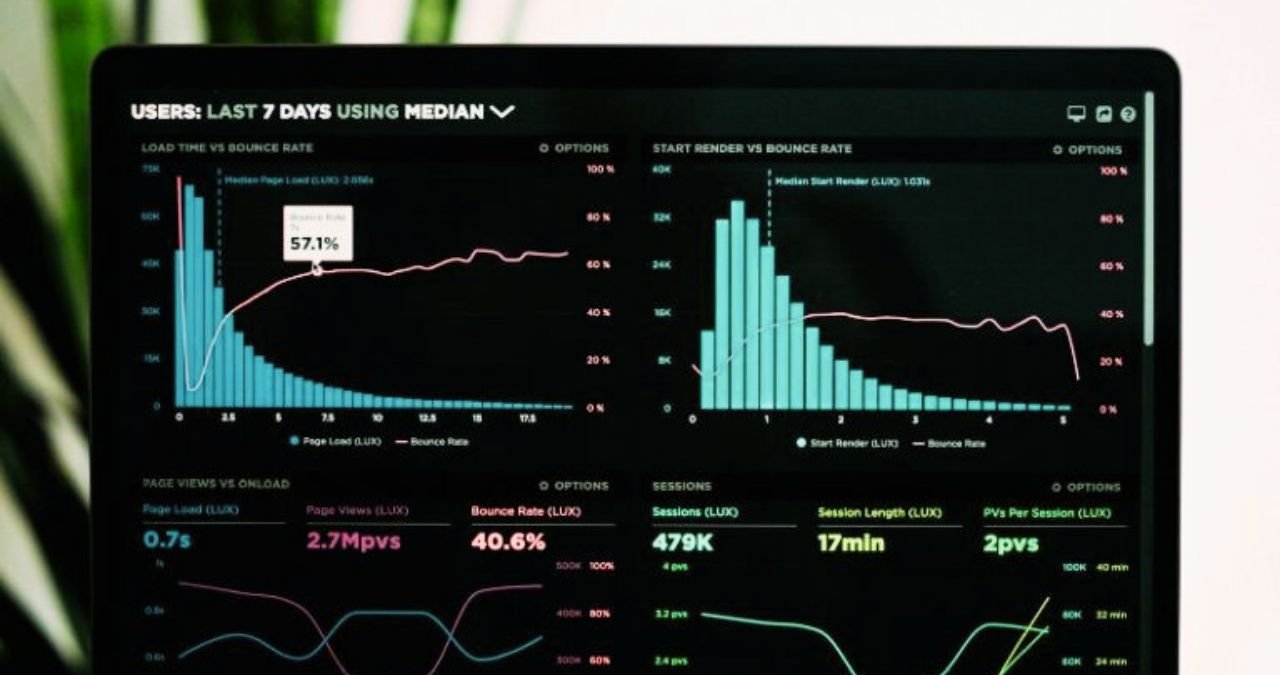
Data Studio: Compulsive stamping of tables and pasting them on Powerpoint pages (which inevitably shrink, making what is inside incomprehensible) or exporting pdfs directly from Analytics (and then losing track of them between emails and cloud folders) are solutions that present a main problem: newly created, the reports are already old.
This translates into junk material accumulating over time, making it difficult to understand which reports to look for.
This happened until recently, but with the release of the Beta version of Datastudio, the new inDrive service from Google, things are bound to improve.
Datastudio allows you to create dynamic and interactive dashboards from different data sources.
If you haven’t noticed yet, you can find Datastudio in the “App” section of Google Analytics, top right.
Once you enter Datastudio, you can decide whether to start a new empty report or start from one of the beautiful templates it offers:
The first operation you will need to do is synchronize your Google Analytics account with Datastudio in order to send data from your site in real time.
You can create new data sources from Analytics and different data sources like Adwords, Google Sheets, Youtube Analytics, Mysql, Search Console, and more.
This is the real strength of Datastudio: simply bringing together data from different sources, which would require additional access for consultation.
In fact, you often have to evaluate the performance of various marketing campaigns; the thing is further complicated when they are managed by different agencies, which use different methodologies and send different reports.
Once your Datastudio has been set up correctly, you will be able to have the data you need always updated in real time, just like within Analytics but without having to browse for customized reports: all you need is a link, and anyone can access the report.
Once the Analytics View is selected, click the blue “Add to Report” button in the top right to import Reports, Dimensions, Metrics, and custom segments from your account.
Now you have a spreadsheet in front of you with which to create time series, graphs, tables, and maps by drawing data directly from your Google Analytics account.
We create within an empty sheet Datastudio to create a first report. Select the “table” item in the top menu and draw the rectangle in which you want it to be displayed on the sheet:
In the right sidebar, you will find all the dimensions and metrics of your Analytics to customize the table with the data of your liking.
In the example above, I selected “Source” as the Dimension and “Sessions,” “Revenue,” and “Conversion Rate” as the metrics.
Furthermore, just like Analytics, here, too, it is possible to choose a range of dates, compare different time frames, apply filters, and select advanced segments with total freedom of maneuver.
Build interactive reports with the filter control
As dynamic as it is, even the table in the previous photo only says ONE thing: the performance of traffic sources for all visitors.
If I wanted to see the performance of only Mobile visitors, then that of Desktop and Tablet, I would have to create three separate tables. Right?
But no. The “filter control” function allows you to bring the report to life, allowing anyone who reads it to interact with the filters you have created.
Select the inverted triangle on the right in the menu to create a filter control to apply to the report.
Now select a Dimension and a Metric from the right menu to apply to the filter control.
In our case, we want to allow people who will read the report to filter the table based on the category of device used (mobile, desktop, and tablet).
Once the controller has been drawn on the sheet, you can decide which dimension and metric to appear as an option using the right sidebar.
Integration with third-party software
Now that you’ve created your Analytics dashboard, you can integrate it with data from other data sources, such as Google Adwords. This way, you will have “everything there,” and you won’t have to jump from side to side.
And if the data source you want to import is absent among the integrations on Data Studio? For example, you want to bring email marketing activity reports with Mailchimp into your dashboard.
In this case, you can proceed in 2 ways:
The first and simpler one is to create a new dataset by importing a spreadsheet (in CSV or XML format) that you downloaded from Mailchimp into Datastudio.
Once uploaded, you can process graphs as you see fit starting from that database. In the example below, I’ve created a simple table to start displaying each email campaign’s Open Rate and Click Rate.
The problem with this simple solution is that whenever you want to refresh the report, you must download a new spreadsheet from Mailchimp and repeat the operation.
The second solution consists of synchronizing Mailchimp with Google Sheets, then the latter with Datastudio.
To integrate Mailchimp with Google Sheets, you need to use the Google Apps Script.
The procedure itself is nothing complicated, and you just need to get your hands on the code to create the script capable of communicating the two systems.
Conclusions
Datastudio was a nice surprise, a simple and powerful tool that can help you create your Reports.
Also Read : 4 Fundamental Metrics For your E-commerce (To Always Keep Monitored)

